2025 KAT+ANNIE EMAIL REDESIGN
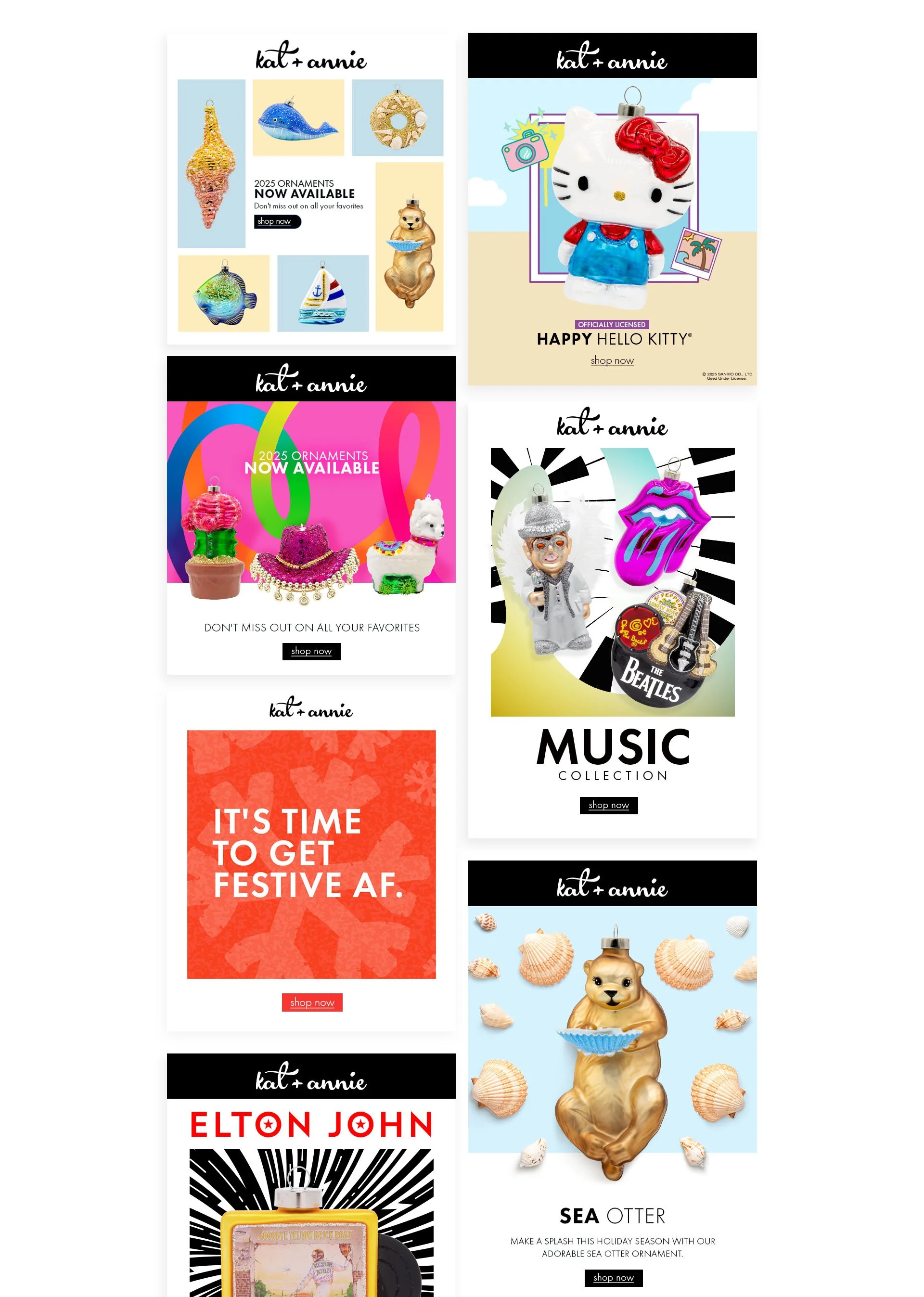
For revamping the Kat+Annie emails, my goal was to create a new design that addressed some functionality issues of our previous template as well as create a new, more vibrant and exciting aesthetic that better fit the brand’s evolving identity.
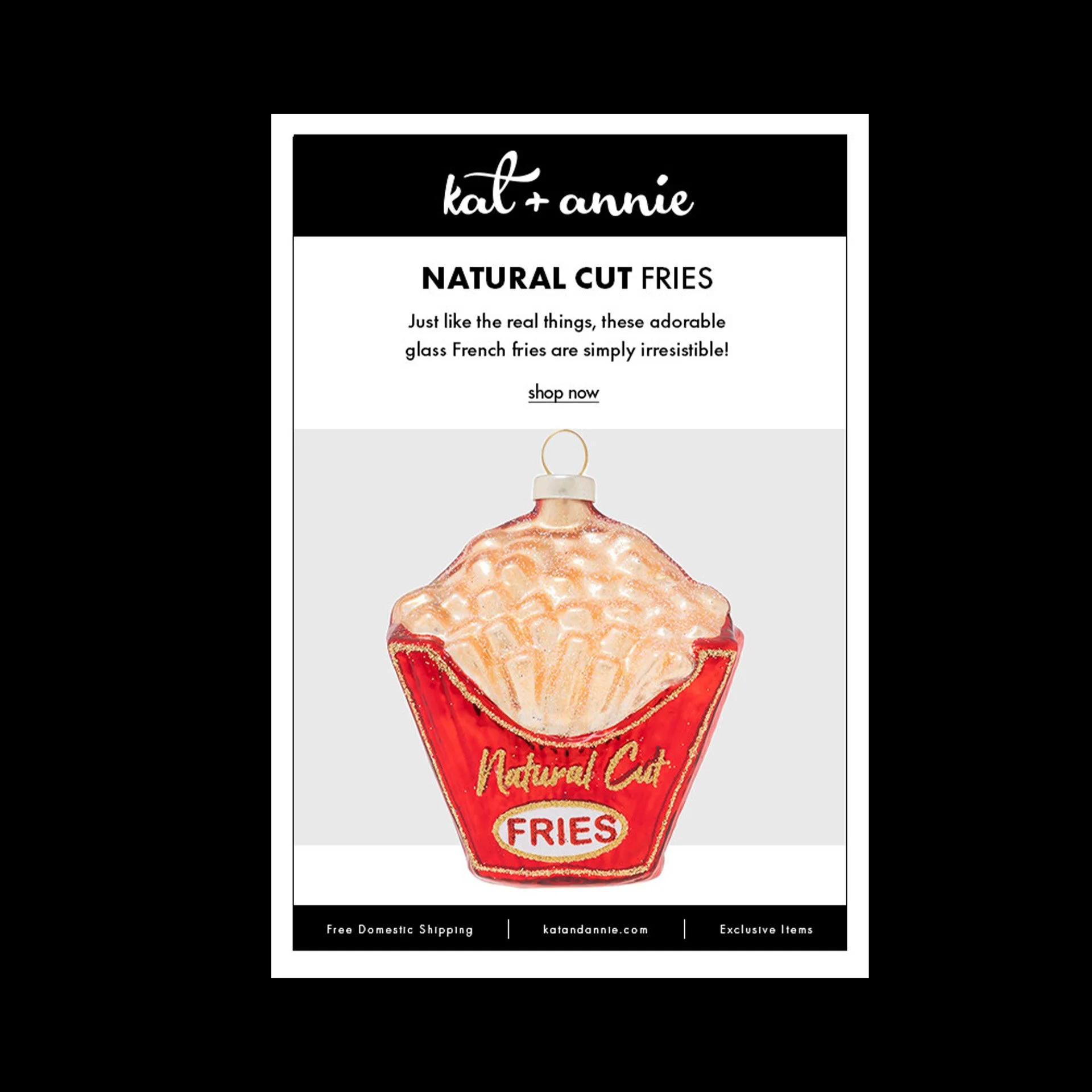
From a functionality perspective, the original template had a frame and footer built into the main section, which data showed acted as a early cut off point for users who assumed it was the end of the email and would not read further which was an issue as the team started building out longer emails. Additionally, the design wasn’t very flexible when it came to ornament shape and size.
One of the strongest points of the previous design, was that the clean black and white aesthetic really let the ornament standout in the email. While we still wanted the emails to be product-centric, we also wanted the tone of the email to be more fun and exciting to inspire interest in the brand as whole.
Previously we had a single email design that was used for the majority of campaigns. I created a flexible series of design concepts that had the same feeling but could be tailored to better fit the ornament or collection being featured. This was particularly useful for licensed product lines such as Hello Kitty or our numerous collaborations with musical groups.


